


Fig. 2.3 basic skeletons of letters
Following the skeletons i made i manage to form pixelated black letter
typeface that im happy with.
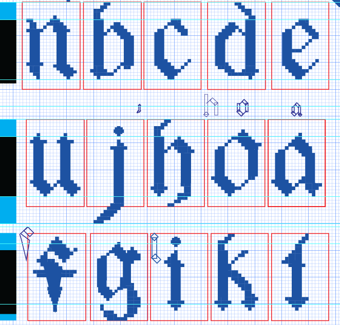
Fig. 2.4 lowercase making process
Along the way i also refine the letters a bit to make them look
neater and that i would look better on the baseline and descender
line. Including making the letters look more cohesive with the
other letters.
Fig. 2.5 lowercase p refinement
Fig. 2.6 lowercase q refinement
Fig. 2.7 lowercase z refinement
Uppercase letters
For uppercase letters i proceded with similar process which is
building the skeletons first before anything else.
Fig. 2.8 Failed attempt of uppercase H
This whacky looking H was he trying to follow the reference and
make a black letter uppercase H but it didn't turn out the way i
expected so i ditch this idea once again and went in with what i
think would be a nice uppercase black letter H.
Fig. 2.9 Uppercase letters skeletons
Based on these skeletons i started building the letters and refine
them to be a bit more cohesive with each other. Some of the
refinements i really like, like the letter G.
Fig. 2.10 Uppercase letters making process
Fig. 2.11 Uppercase letter G refinement
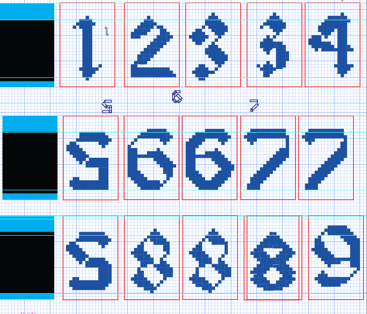
Numerals and punctuations
For the numerals i did them wrongly which i did them in the
lowercase grid instead of the uppercase ones so the height and
sizing is wrong and i had to refine and rework them. Along the
way i did some refinements as shown in the images below, along
the process i'm just trying to figure out which looked the
best and changing as well as twigging them if i don't like the
form of it.
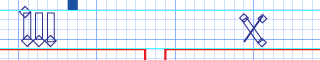
Fig. 3.1 numerals refining & making process
Here you can see that i am creating and refining the
numerals and punctuations as well, reworked on them a few
more times to ensure that they are following the right
height. Some of the strokes i just dont think that pixlating
them will work, as you can in the number six. Instead, i
decided to just for a this straight line in order to look
more neat.
Fig. 3.2 Difference in strokes
Fig. 3.3 punctuations making process
Fig. 3.4 punctuations making & refining
process
Half way, i even tried compiling them to see how it looked
and move on to worked on it more.

Fig. 3.5 letters compilation
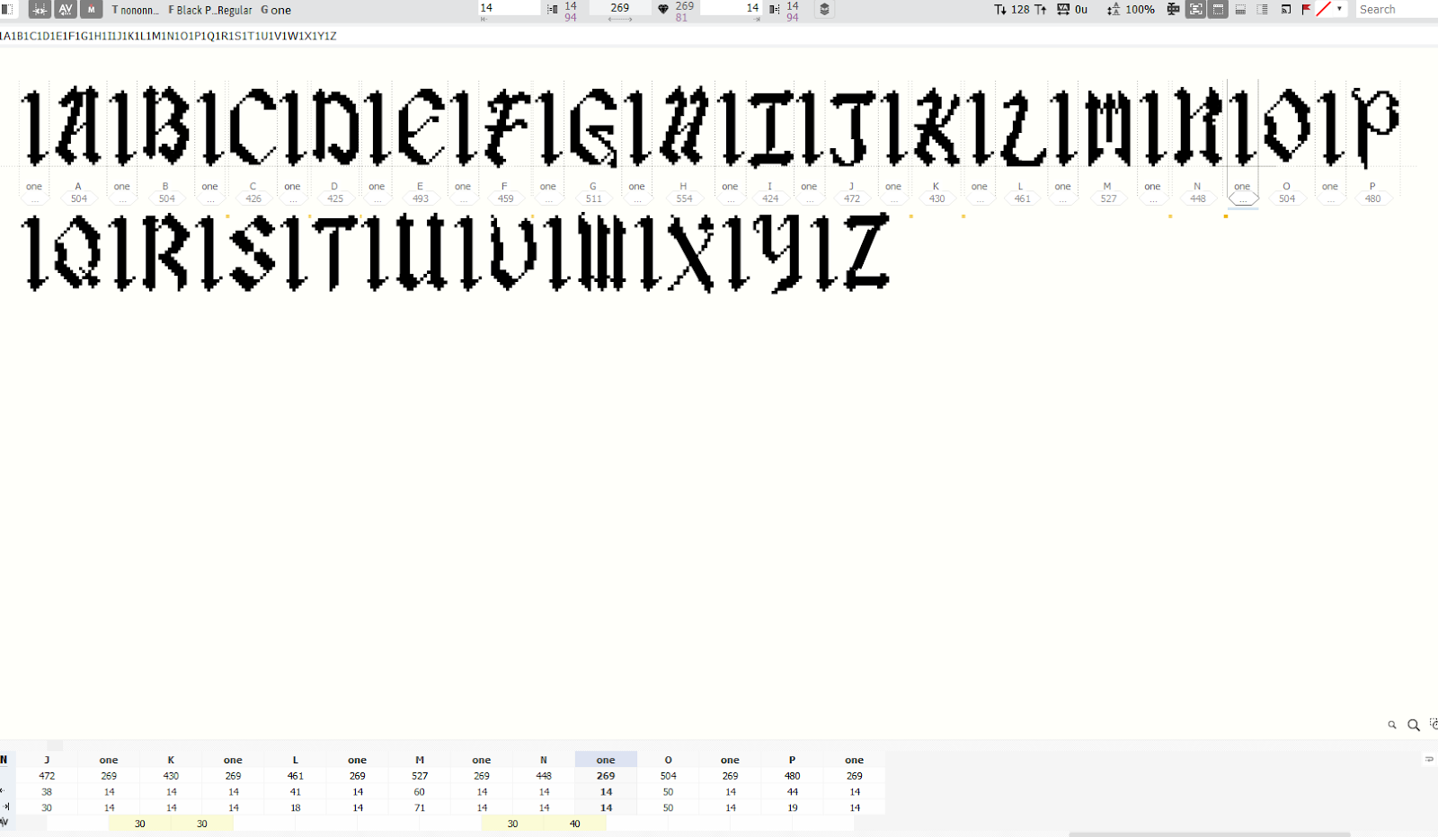
Importing the font into Fontlab 7

Fig. 4.1 Putting it into fontlab
Dealing with font design in FontLab has been an arduous
journey for me. Putting my letters into FontLab was
unexpectedly challenging, requiring intricate
pathfinding and merging of elements before pasting them
into the software. This process alone consumed more time
and effort than I initially anticipated.
Adding to my frustration, some of the imported letters
didn't retain their original size. Instead, they
appeared larger than intended, complicating the entire
design process. My quest for a solution led me through
numerous tutorials, but none seemed to address this
particular issue, leaving me feeling stuck and
overwhelmed.
To exacerbate matters, FontLab itself became a source of
constant frustration. The software frequently crashed
and became unresponsive, adding an extra layer of stress
to an already challenging task. In moments of
desperation, amid tears and the weight of other pressing
assignments, I stumbled upon a potential solution: the
free transform tool.
This tool allowed me to resize the fonts to their
correct dimensions, aligning them with the guides I had
meticulously created. This discovery marked a turning
point in my font design ordeal, providing a glimmer of
hope in an otherwise daunting process. While the
challenges persist, this newfound technique has become a
beacon of progress in my journey to create the perfect
font amidst the chaos of FontLab.
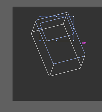
Fig. 4.2 Kerning screenshots
Font Presentation
Looking for inspiration
For inspiration, I turned to Pinterest to explore various font
designs, seeking simplicity and avoiding overly intricate styles
that might overshadow the font itself. After thorough searching, I
identified a few examples that struck the right balance—simple yet
elegant, ensuring the design enhances the font without
overwhelming it.
The pixel world design concept is derived from a song cover by one
of my favorite artists, PLAVE. The inspiration for the pixelated
font comes directly from the artist's album cover, which
captivated me with its relevance and applicability to the song's
essence. The unique pixelated font, as featured on the album
cover, resonated deeply with the overall theme and mood of the
song. It's a deliberate choice that not only pays homage to the
artist's style but also adds a layer of relatability and coherence
to the visual representation of the music. This design decision
aims to create a seamless connection between the typography and
the song's narrative, enhancing the overall experience for the
audience.
Fig. 5.1 Pinterest reference of font presentation
Fig. 5.2 Combining and blurring pictures in photoshop
For the first font presentation, i've decided to combine and
blend 2 different images together to convey a different
perspective of the same work. I imported the images in photoshop
and did it there. When im finally happy with the result of the
background, i exported the image from phoroshop and proceed my
process in illustrator.
Fig. 5.3 Pinterest reference of font presentation
The is the second final version of it which i will soon refine
it further more down the line.
Fig. 5.4 making the grid design
Fig. 5.5 adding a retro background
Fig. 5.6 adding elements
This is just to present the font name, i wanted to do like a
grid simple background initially but soon think that it is
too plain. Hence, i added the the background as well as the
gaming elements to indicate the purpose of the font.
Fig. 5.7 overview of font presentation
For the others, i also did some trial and errors to find the
perfect layout that is unique yet now overpowering my font.
I decided to keep some of them simple and just lay the
letters out next to each other with the retro pixels
aesthetic that i intended to have.
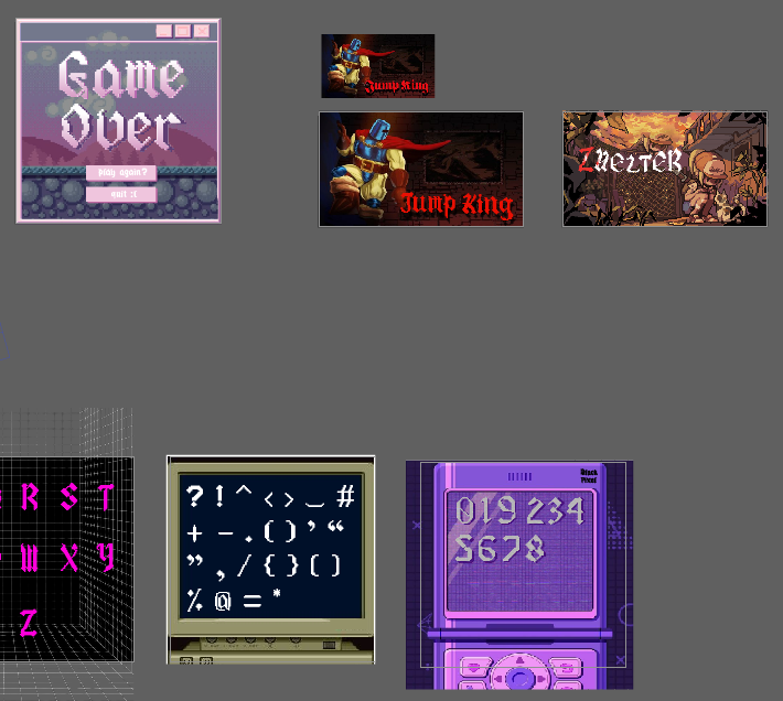
Font Application
For the font application, I had to do what i intended my font
to solve first which is changing and replacing the original
Jump King title to a pixelated one. I removed and edited the
background in photoshop before exporting it so i can work it
in illustrator.
Fig. 6.1 Jump king poster font removal
The is what is looks like without the font in it, in
illustrator i had to add shadow to my original font display
so that i will have a dimension like the original Jump King
title has.
Fig. 6.2 Replacement of my font to the original poster
Next i had another game title font that i wanted to rework
so that it fits the game aesthetic and concept more which
is the game Zhelter.

Fig. 6.3 Zhelter title making process
Fig. 6.3 font application working overview
Furthermore, I had an idea to make the model of a game
boy. Something like a model blueprint with my font
included in the blueprint. Below are the processes. Using
the pen tool, i made each of the lines and dimension to
make it more like a actual blueprint of the gameboy model.
Soon, including the labels using my font to fit the
digital gameboy aesthetic.
Fig. 6.4 Gameboy blueprint making process
Initially, I utilized the pen tool to outline the
fundamental shape of a Game Boy. Subsequently, I
incorporated the line tool along with the pen tool
to introduce depth to the artwork. I enhanced the
visual appeal by incorporating a gradient
background, aligning my text on the sides, and
labeling various elements using my chosen font.
FINAL DESIGN
Fig. 7.1 Font presentation 1.jpg
Fig. 7.2 Font presentation 2.jpg
Fig. 7.3 Font presentation 3.jpg
Fig. 7.4 Font presentation 4.jpg
Fig. 7.5 Font presentation 5.jpg
Fig. 7.6 Font presentation
6.jpg
Fig. 7.7 Font presentation
7.jpg
Fig. 7.8 Font presentation 8.jpg
Fig. 7.9 Font application 1.jpg
Fig. 7.10 Font application 2.jpg
Fig. 7.11 Font application 3.jpg
Fig. 7.12 Font application 4.jpg
Fig. 7.13 Font application 5.jpg
Fig. 7.14 Font application 6.jpg
Fig. 7.15 Font application 7.jpg
Fig. 7.15 Final compilation.pdf
Feedback
Week 8:
General Feedback: Try not to generalize your topic/be very specific with your topic Personal Feedback: Go with the second idea and dont waste time.
Week 9:
General Feedback: Do not waste time and start working on our final task. Do not erase your design process in your AI as they are prove that you did it. When we design the letters wecan start by designing the letters h,o, a, n.
Specific Feedback: Refer to hsiao blog. Approved proposal and start working on my letters. Use grid as guiges when creating my letters.
Week 10:
General Feedback: It will be good to develop your uppercase and lower-case letters next to each other.
Personal Feedback: Make the serifs a bit more consistent, change the l to look more like an l. The j I can add serif to the end to make it curved up a bit.
Week 11:
General Feedback: Font presentation and font application is different. Shown some examples of the differences from the past seniors' work. We should finish our font today before going home, print it out and let it get checked.
Personal Feedback: The fonts are good but work on my punctuation fast, try to finish every letter and punctuations today.
Week 12:
General Feedback: Use the guides provided in teams to kern your letters. Make sure you identity which is font application and font presentation as they are different. He showed us an example of a seniors work.
Personal Feedback: Make sure your background does not overpower your font.
Week 13:
General Feedback: The artboard size can be anything as long as it does not exceeds 1024px. If you're doing application if u use another font other than the one u make try not to use a decorative font or display font so that it don't overpower your font.
Reflection
Experience
I quite enjoyed this task because of the creative freedom it
offered—from conceiving my own idea, tackling challenges, to
transforming it into an actual font. I experienced the highs and
lows of witnessing my font take shape and encountering setbacks that
deviated from my initial vision. The process of transferring my font
into FontLab presented its own set of challenges, dealing with
issues like incorrect sizing and imperfect pasting. Despite these
hurdles, the most enjoyable part for me was crafting and designing
my font application and presentation. The flexibility in presenting
the font allowed me to explore a new aesthetic that I hadn't delved
into in my previous designs.
Observations
Observing how the task went, I was reminded again and again of
the letters p and q to be on the baseline and the stem to land
on the descender line so that it does not appear to be floating later
on. On top of that, I was reminded to check the cap height and the
numerals to be almost as large as i initially did it differently and
made it the same size as the lowercase letters and had to change it. I
also did some observing while making the punctuations to see how some
of them land on the baseline next to a letter and some floating, their
size in comparison with the other as well as the lowercase and
uppercase letters.
Findings
Embarking on this task was like taking a journey on an emotional
rollercoaster, with its highs and lows. The initial excitement of
crafting a font from scratch brought a thrilling sense of bringing my
creative vision to life. The twists and turns of this creative
journey, marked by moments of joy as my font evolved, were
complemented by the inevitable challenges that emerged, mirroring the
unpredictable nature of a rollercoaster ride. Yet, the process of
applying the font and solving associated problems provided a profound
sense of fulfillment and accomplishment, witnessing the final product
come together. Creating a pixel font added an extra layer of
complexity, demanding meticulous attention to detail; a single
misaligned pixel could drastically alter the appearance of an entire
letter. Midway through the task, I found myself pondering, "Why did I
choose to make things challenging by opting for this particular font?"
Despite these moments of doubt, I successfully navigated the
challenges and grew to appreciate the final result. The sense of
achievement and the visual appeal of the completed font made the
journey worthwhile, emphasizing the satisfaction derived from
overcoming difficulties in the creative process.
Further Reading
Typography Design Elements To Consider for Print & Web
Design
1. Colour contrast
Although the idea of good colour contrast may seem simple, there are a
few aspects that are easy to forget when choosing colours for your
typography and overall design.
Placing black text on a white background is a common mistake that is
also the simplest to correct: this creates too much contrast! The
majority of beautifully designed websites have black font on a white
background, however the writing is actually grey instead of black. By
using this technique, the contrast is reduced and reading becomes
easier for the audience.
2. Font size
Here, print and online design are different mostly because of the
media they are used on.
While 10 point fonts are commonly used for body content in print
design, pixels are used on the web. For body copy on the web, 13px is
a suitable size to stick with as the equal of 10pt. The ordinary
viewer won't be able to read anything smaller than these sizes.
3. Hierachy
Here, print and online design are different mostly because of the
media they are used on.
While 10 point fonts are commonly used for body content in print
design, pixels are used on the web. For body copy on the web, 13px is
a suitable size to stick with as the equal of 10pt. The ordinary
viewer won't be able to read anything smaller than these sizes.


.jpg)
.jpg)

Comments
Post a Comment