30/ 8/2023 -
Adriena Tan Yan Zi/ 0351236
Advanced
Typography/ Bachelor of Design in Creative Media
Task 1
Exercises
Lectures
Ad Typo 1: Typographic systems
All design are based on structural systems
-Axial
-Radial
-Dilatational
-Random
-Grid
-Modular
-Transitional
-Bilateral
Elements are dependent on communication to function. There are additional criterias like reading, legibility, contrast Shape grammar is a set of shape rules.
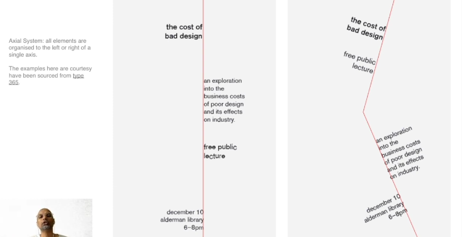
Axial System Elements organised left or right aligned to a single axis
Radial system
Elements being extendent from a point of focus
Dilatational System
Expand from a central point in a circular fashion
Information/ text on either sides of the ring
Exciting and organised, in colour and size
Random System
Appear to have no specific order or pattern
Grid System
Vertical and Horizontal divisions
Transitional System
Far right top
Far right bottom
Informal system of layer banding
Could have text on either sides of the band
Modular System
The units have to be same size and standardise
Units can be randomly placed like the unit/ paragraph can be in the
middle
Bilateral System
Arranged symmetrically on a single axis
Mostly used in invitation card/ formal invites
An understanding of the systems organisation process allows the designer
to break free from the rigid horizontal and vertical grid system of
letterpress.
AdTypo_2_Typographic Composition
Arrangement of textual information within a given space, print,
textile, building or any given space.
Design composition which are emphasis, isolation, repetition,
symmetry and asymmetry, alignment, perspective to name a
few.
Seems to be ambiguous
Seem more relevant to the imagery
Not as easily usable
The rule of thirds
No one would ever use this because there are more favourable
options
Typographic systems
The grid system is the most used system in typography
Very versatile often used today
People use this system and include creative elements to make it less
rigid
Environmental Grid
The exploration of numerous structure combined together
Anything that creates structure
line s are formed in this superstructure
Associated with the associators to the communicator of that
message
Form and Movement
To dispel the seriousness surrounding the application of the grid
system
See the turning pages of a book as a slowed down
animation
Over many pages creates movement
Page or page is irrelevant


AdTypo_3_Context&Creativity
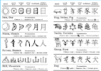
Handwriting
First letterforms were made to imitate handwriting
Basis and standard
Materials to make them are sharpened bones, charcoal, sticks, plant
stems, brushes, feather and steel pens
1715 BCE
Cuneiform
- The earliest system in actual writing
- Numbers of languages
- Pressing the blunt end
- The blunt end of a reed stylus into a wet clay tablets
Hieroglyphics
• Egyption writing system
• Art of relieved carving
• Mixture of both rebus and
phonetic characters
• Hieroglyphic images could be
used as ideograms, determinatives and phonograms
• Phonetic alphabets consisting
of 22 letters
• Adopted by the greek
• They have no serifs
• The letters grew
thicker
• Model for calligraphic in the
past 2000 years
• Roman letters were becoming
more rounded
• Curved forms allow for less
strokes therefore faster
• Europe was in dark ages,
handwriting didnt evolve
• Distorting and coming out
with variation
• Standardisation took
place
• Humanistic typing
• It cost a lot
• Printing on wood block has
already been practice in china, korea and japan
• The diamond sutra with
printed illustration
• Korea establish a foundry to
cast movable type in bronze
• Allowed the dismantling and
resetting of text, hangul
• Out of style to credit africa
• Greek and rome have more
influential civilisations
• Process worked to create the
discipline of Indology
• Same goes to classcism,
egyptology, africanism, Indology and orientalism
• Typographer pays homage for
developments
• Hand written styles into
mechanical forms
• Would begin digitalsing
historical character and sell or licensed them

- Oldest writing found in the
India Continent, Indus Valley Civilization(IVC)(3500-2000 BCE)
- It is undeciphered and is
believed to have non- linguistic nature
- The script is very
decorative, showing how advance the IVC was
Figure IVC Script in seal(left), IVC script(right)
- The Brahmi script (450-350
BCE), A parent script to most of the scripts in south India, is the
earliest writing system developed in India after the Indus script.
- A lot of script/writing in
South Est Asia derived from this script
- It is believed that this
script was at least influenced by one or more Semitic script due to
much cross cultural exchange
HANDWRITING
- Oldest writing system in
South East Asia were Indian script, with the most important being
Pallava and Pra-nagari for writing Sanskrit
Figure Pallava
Figure Pra-nagari
- However, not all the script
in Nusantara was borrowed from India.
- Indonesia had a script used
for communication with other kingdom called Kawi(poet)
- This made Kawi widespread,
resulting in the kingdoms in the Malay Peninsula to use both Indian
and Kawi script to write old Malay
Figure Kawi Script
- Indonesia have a
variety of scripts that assimilated into Peninsula Malay. For
example. Incung is used in Kerinci
- Jawi was introduced along
with Islam
- Ancient Societies in SEA
and SA were often classiest. Islam did not changed this entirely but
encouraged teaching for the sake proselytization
- Missionaries practising
Islam would have taught in Jawi, spreading Jawi among the upper and
middle classes
- Jawi is important in
Malaysia bc it was the script used for al the famous literature work
(like hikayat and al)
- But Jawi is not “tulisan
asal Melayu”
Why is handwriting important?
- Important to learn because
all digitized handwriting is derived from actual handwriting
Programmers and type Designers
- More software
giants(google) are producing vernacular script
- More vanacular and
‘multi-scrip’ typeface are being produced to cater to situation
where written matter is communicated in vernacular script or
vernacular and Latin script.
Figure Baloo(font with a blend of latin and vernacular
fonts)
Local movements and individuals(to help preserve local handwriting
and scripts)
- Murasu.com by Muthu
Nedumaran
- Huruf
- Ek Type and Indian Type
Foundry
Instructions
Task 1: Exercise 1 - Typographic Systems
In this exercise, we were introduced to 8 different systems in typography.
These 8 systems includes Axial, Radial, Dilatational, Random,
Grid, Modular, Transitional and Bilateral. These systems expand the
visual language of typographic communication and invite the reader into the
text. We were also advised to watched the lecture videos and tutorial videos
in the typography youtube playlist.
-using Adobe InDesign only
-Size 200 x 200 mm
- allowed to use
one other colour
-Graphical elements (line, dot, etc.) can be used but
limitedly.
Practical and process
Fig. 1.1 Process with guidelines
Axial
Fig. 1.2 Axial layout attempts
I experimented with the titles at first because I wasn't aware that we
could only use one title for all the systems to see which one would best
suit the alignment I had in mind. The first two images in above represent
the alignment I worked on first; in my opinion, they appear better without
the actual diagonal lines in display. I try to tone down the diagonal idea
and only use the top and bottom of the alignment for the second alignment
since I think it to be a little more aesthetically pleasant.
Fonts used: - Futura Std
- ITC Garamond Std
Radial
Fig 1.3 Radial layout attempt
For the radial system, I experiment with two possible layouts that I
have in mind, the first of which is seen on the left. I made an effort
to position the radial focal point at the canvas's top and lower left
corners, respectively. Since the lecturer allowed us to use a colour
other than black, I chose sea green and drew a line to the top left to
suggest that it is spreading out like a beam of sunshine. For the second
layout, I wanted to mimic the appearance of a sun, so I added more
radial rays to the upper left corner.
Font used: Bembo Std
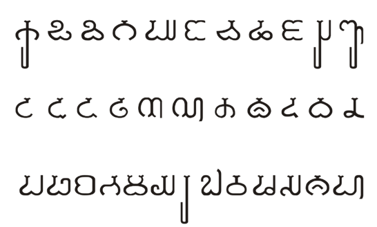
Dilatational
Fig 1.4 Dilatational layout first attempt
For dilatational I used circle as guides and type on the circle to
create the semi circle overlapping effect. The background as the
seagreen that i've picked and have some of the fonts as both black and
white.
Font used: Univers LT Std
Random
Fig. 1.5 Random layout attempts
I experimented with two configurations for the random system to
determine which would work the best. In contrast to the second
layout, where the majority of the text is crammed, the first
layout's elements are primarily gathered at the top. The second
layout also has some jumbled text in the middle, but overall it
doesn't feel overly packed.
Fonts used: Futura Std
Bodoni Std
Gill Sans Mt
Adobe Caslon Pro
Grid
Fig.1.6 Grid system attempt
For the grid system I start by creating the guides first then
determine where I want the tile to be placed at. Once I have place
the texts in their designated places I added a seagreen coloured box
once again and the fonts that the green boxes touches turns white.
In my opinion, the information is displayed clearly which is what i
intended to do for to indicate this is a grid system.
Font used: ITC Garamond Std
Transitional
Fig 1.7 Transitional system attempt
I had to look up a tutorial to get started on the canvas for the
transitional system because I only had references from Pinterest and
didn't know how to make the text line wavy. I discovered the text on
path feature in Design after doing some research. In this layout, I
deliberately aligned the text to look like a mountain shape, which,
in my opinion, worked out well.
Font used: Bembo Std
Modular
Fig 1.8 Modular system attempt
I struggled the a little while making the layout for this system
because I find it quite similar to the grid system. I created like a
stairs like pattern in this layout that carries the body texts which
looks neat yet aesthetically pleasing. I added the coloured boxes to
make it look coherent with the rest of the system placing important
titles inside.
Fonts used: Adobe Caslon Pro
Bilateral

Fig 1.9 Bilateral system attempt
For bilateral system, I left a gap in the middle to leave a space for
the title so that it is the most noticeable element on the canvas to
capture the reader's attention. Follow up with that, I aligned with
the horizontal axis with the detail texts at the sides.
Fonts used: Bodoni Std
Final Compilation
Fig. 2.0 Final collage
Final Outcome
Fig. 2.1 Final Axial layout jpg
Fig. 2.2 Final Radial layout jpg
Fig. 2.3 Final Dilatational layout jpg
Fig. 2.4 Final Grid layout jpg
Fig. 2.5 Final Random layout jpg
Fig. 2.6 Final Transitional layout jpg
Fig.2.7 Final Modular layout jpg
Fig. 2.8 Final Bilateral system jpg
Final Outcome PDF
Fig. 2.9 Final PDF without baseline
Fig. 2.10 Final PDF with baseline
Task 1: Exercise 2 - Type and Play
Part 1: Finding type
For this task, we were asked to select or choose and image that
we would like to refer and extract out type from. Organic or man-made is
fine.
- Uppercase or lowercase only
- Choose reference typeface
from the 10 typefaces given or any other typefaces should be
fine.
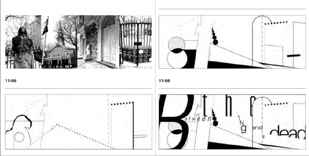
1. Chosen subject
Fig. 3.1 Subject image
This is the image that I chose. I chose this picture as I find the
organic curves and shapes in the seashells is workable for me to find
potential letters and think that the typeface that I will be able to
find would be unique. The letters I found in this image are M, O, W, E,
S, A.
Letterform extraction
Fig. 3.2 Extraction process
I first try to identify the placement and form of the letters, then
proceed to to traced it out in Adobe Illustrator with the pencil tool
in the first picture then fill in in to get a better understanding of
the form of the letters that were spotted.
Fig. 3.3 Extracted letters
The above are the letters that I have extracted, they are mostly
rounded and still somewhat cohesive with each other.
Reference
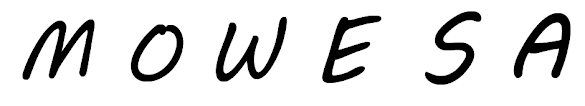
Fig. 3.4 Reference letters
Font chosen: My Boli
I chose this font as my reference as I find similarities in this
existing font and the font that I have extracted and wanted to use
this a guide to develop my typeface.
Digitalisation and Refinement
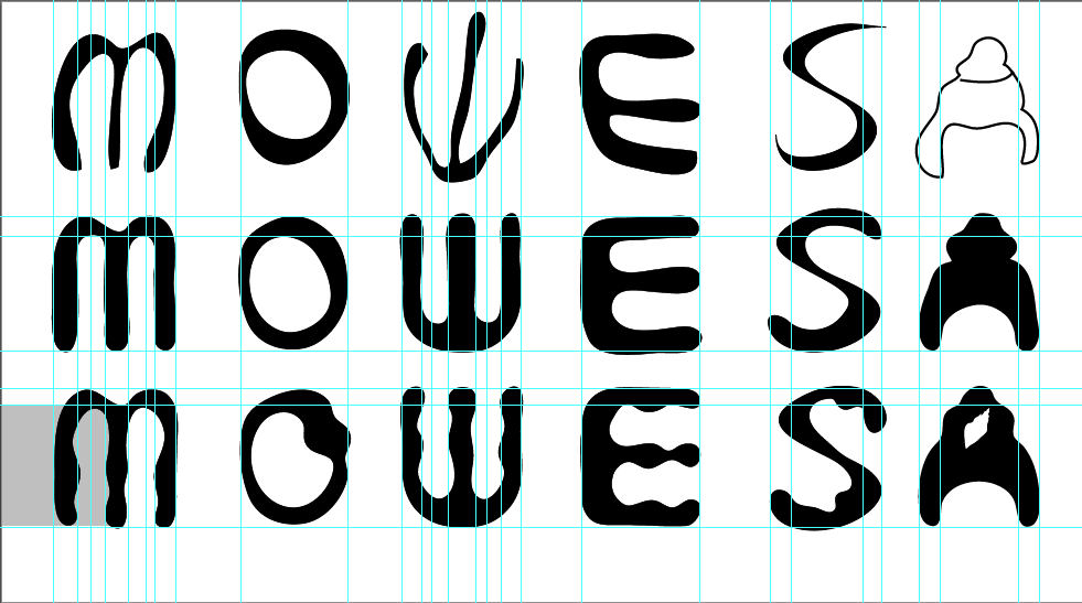

Fig. 3.5 Refinement process with baseline
Here is the overview process with guidelines i used in Adobe
Illustrator, the bottom line is my reference font which I
refer to as I refine my text.
Here is the step by step stages on how I go about refining
my fonts .
Fig. 3.6 Straightening the stems
In the first refinement stage, i tried to make the
inconsistent thickness of the extraction even and straighten
the steps out to make it appear to be a little more
neat.
Fig. 3.7 Adding waves to the straighten stems
Here in the second step, I tried to include make the
insides of the font wavy like waves in the ocean or even
the curvy line on the seashells.
Fig. 3.8 Creating vertex corners for the text
Soon found the previous result of the last refinement to
be a little basic, I tried something that's out of my
comfort zone which is to make the corners and outer
lines straight and sharp.
Fig. 3.9 Thickening the wavy stems
Noticing that the wavy lines might appear better if
they are thicker so I went ahead and increase the
thickness to all of them which in my opinion I'm
satisfy with the result.
Fig. 3.10 Refining the vertex by slightly curving
them
I showed the above result to my lecturer and got his
approval with the overall font refinement but he
suggested to make the sharp vertex less sharp and
just a little curved, which I took his advice.
Making interactive poster process
Fig. 4.1 Editing the subject image
To get this, the original subject image with is
the seashells and an image of a serene beach has
to be merge together which i used the double
exposure technique in photoshop wo had them
merged together. Then proceed to apply the
duotone effect to get this effect in the
end.
Fig. 4.2 Adding shadows
Still not happy which the outcome of the
duotone and double exposure effects, I tried
to include shadows to the image by using the
brush tool to be more coherent with my final
font.
Fig. 4.3 Edited subject image
Finally I have come to a satisfactory result as
well as have an interactive element which is the
seashells image with my final typeface.
Poster Progress
We were asked to finally make a poster that is
interactive with our final font, which I wanted to
incorporate the seashell image that I extracted my
font from and also to make it seem like a movie
poster, I added the necessary elements and features
to indicate that it is a movie poster.
Fig. 4.4 Type poster trial
Final Poster
Fig. 4.5 Final Poster JPG
Progress Jpeg
Fig. 5.1 Type progress jpg
Fig. 5.2 Type progress jpg
Fig. 5.2 Type progress jpg
Final PDF
Fig 5.3 Final Progress PDF
HONOR Talents Global Design
2023 HONOR Talents Design Themes:
1. Cultural Prosperity · Celebration: A Totem of Renewing Festive Culture
Create with important traditional cultural elements of various countries, such as Lunar New Year, Mid-Autumn Festival, Dragon Boat Festival, Christmas, Mother's Day, Day of the Dead, Halloween and Eid al-Fitr.
2. Renewal of life · Return: Contemplate human beings' relationship with all things.
With sustainable development as the starting point, your creations must incorporate the concepts of environmental protection, biodiversity, energy conservation and emissions reduction within the design details.
3. Genesis · The Future: Imagine the Innovative World of the Future
The world of the future will be constructed with the power of technology and art, using creativity and imagination.
After going through the description and requirements i decided to have my artwork based on one of the more infamous celebration in the Chinese culture, the "Mid Autumn Festival" which is one of my favourites. I decided to include 3d effects in it to bring out the liveliness of the artwork, i always feel connected to this festival since young, feel at ease seeing the candles and lights in the night sky.
Progress
I started by making a simple flowers with shapes and the shape builder toll, meanwhile trying different colour combinations to see which work the best in harmony together.
Here making more different types of flowers as i want the flowers to portray a type of liveliness and colourful atmosphere of the festival. Also, mooncake commonly enjoyed during the festival often comes in the traditional flower shapes.
Here im just composing a bunny that also represent the festival staring up the sky, a friend of the legendary jade bunny, looking up at the moon pondering when will its friend finally come back.
Of course, we couldn't miss out the moon that is the signature of this festival, diagonally facing the bunny indicating that the bunny is deep in thoughts while admiring the moon. Lots of people actually enjoy tea with mooncake, enjoying the company of a bright full moon in the night sky.
After creating all the necessary elements, I'm just using the 3D Effect tools to inflate the artwork to finally bring life into the artwork, trying to find the best combination among the elements and the 3d effects.
I tried to improve the shadowing a little here which worked better in my opinion.
Final Artwork 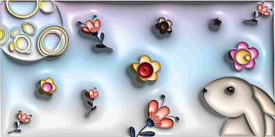
Feedback
Week 1
General Feedback: Should listen to 3 of the
mentioned lecture videos before we start exercise 1. Will not go through
everyone's work as there's not enough time to go through the whole class so
take note of the feedbacks he gives for others.
Week 2
General feedback: Do not put the text in the
column interval. Stick to Bilateral and not multilateral. Try to use the
same colour and shade for all the systems. Try not to have too much contrast
in one artwork. Do not squeeze the texts together. Should update our
processes as we go.
Personal Feedback: Good job on the layouts.
Week 3
General Feedback: Need more time than just 1 day spend on all the tasks. A lot of the process is up to you to decide and suggest, there room for change. Joins the ends together to make it come together. Should get better and pay attention to the shapes instead of the line in extraction.
Personal feedback: Try to make the sharp edges a bit more curved.
Reflection
Experience
For the first task, I was a bit frighten to
attempt as I know that I have not been very good with layouts and the
software InDesign especially with the past experiences i gained from
typography, so I have to admit that I did search up a lot of examples of
each layout in the internet as reference which helped get my ideas flowing
a bit before I started with my attempts. I would try to come out with more
than one layout but sometimes even if i try to squeeze every part of my
brain, my creativity is limited which led me to having some of the layout
having more attempts than another as i find some of them not as confusing.
For the finding type exercise, I actually found it a bit more fun than the
first exercise as they challenge us to determine what kind of type we can
find in an ordinary image that we usually wouldn't pay much attention to.
Refining and extracting has been fun in the progress as I went through
trials and errors to figure out what kind of features and elements would
work.
Observations
Paying close observation to the requirements
stated in the brief and how we can utilise the elements abiding the
requirements is a little challenging or me as I have to constantly check
up on the text formatting, alignment, point size, and of course the
overall layout balance. Personally, the play of a single colour into this
task is refreshing comparing to the past tasks that we had. In finding
type, I have learned to observe only the lines but also consider the
shapes consist in the picture. Before deciding on the final subject
pictures, i went multiple pictures and asked for the lecturer's opinion
before settling on the final one that's where i gained the insights and
knowledge of observing. Also observing the mood, the vibes and the
aesthetic of the picture i tried to keep the consistency while doing my
refining process.
Findings
I find the system to be an exercise that is
challenging for me personally but I managed to persist to the end and made
it through with enough resource images that i sourced from the
internet.
Further Reading
Hans Arp's Counter-Typography by Tessa Paneth-Pollak
Typographical Microbes
The third issue of the journal Dada, on which it seems likely that Arp worked closely with the Romanian-born poet Tristan
Tzara (the journal’s editor), seems to mark an apogee in this kind of production: the
issue opens with Tzara’s ‘Dada Manifesto 1918’, and features an explosion of woodcut
forms by Arp alongside poems and in advertisements. Seven Arp vignettes appear in total,
the most that any issue of the journal had featured to date.
Tzara exemplifies this conceit later in the text when he lambastes the
newspaper specifically, the art criticism that it contains – as ‘Flabby, insipid
flesh reproducing with the help of typographical microbes’.61 With this wonderfully weird and
precise descriptor, Tzara identifies the typographical As, Bs, and Cs as formal units
responsible for the production of linguistic content.
Copulation
This approach to language, which emerges with new clarity in the Arpaden,
prioritizes the lateral melding of graphic units over those units’ connection
to the surface of inscription (their support). The fragments that make up
these compound silhouettes conjoin into singular entities according to an
ideogrammatic principle that Guitemie Maldonado has summarized with
the mathematical formula ‘1+1=1’. The Arpaden function similarly to the
copulative symbols of Japanese writing as Eisenstein understands them, as do
Arp’s linguistic amalgamations. More than the sum of their parts, both render
the standardizing attempts of dictionaries useless.
Drawers of the Brain
In so far as the units named in the
titles of the Arpaden merge in the undifferentiated interiors of silhouette,
we cannot divine exactly where ‘moustache’ ends and ‘hat’ begins (see
plate 5). Similarly, to form the word-grafts Schnurrhut and Schnurruhr
Arp truncates the full word for ‘moustache’, Schnurrbart. In denying or
altering the spatial divisions of language, then, Arp’s imaginary writing
system also defies the categorical divisions of typology
.jpg)


Comments
Post a Comment