Task 2: Key Artwork and Collateral
13/9/2023 - /9/2023 / Week 3 - Week
Adriena Tan Yan Zi /
0351236
Advance Typography / Bachelor of Design in Creative Media /
Taylors University
Task 2: Key Artwork/Collateral
.jpg)
Lectures
AdTypo_4_Designing Type
Why do we need to design more typefaces?
Type design carries social responsibility
Improve legibility
A form of artistic expression

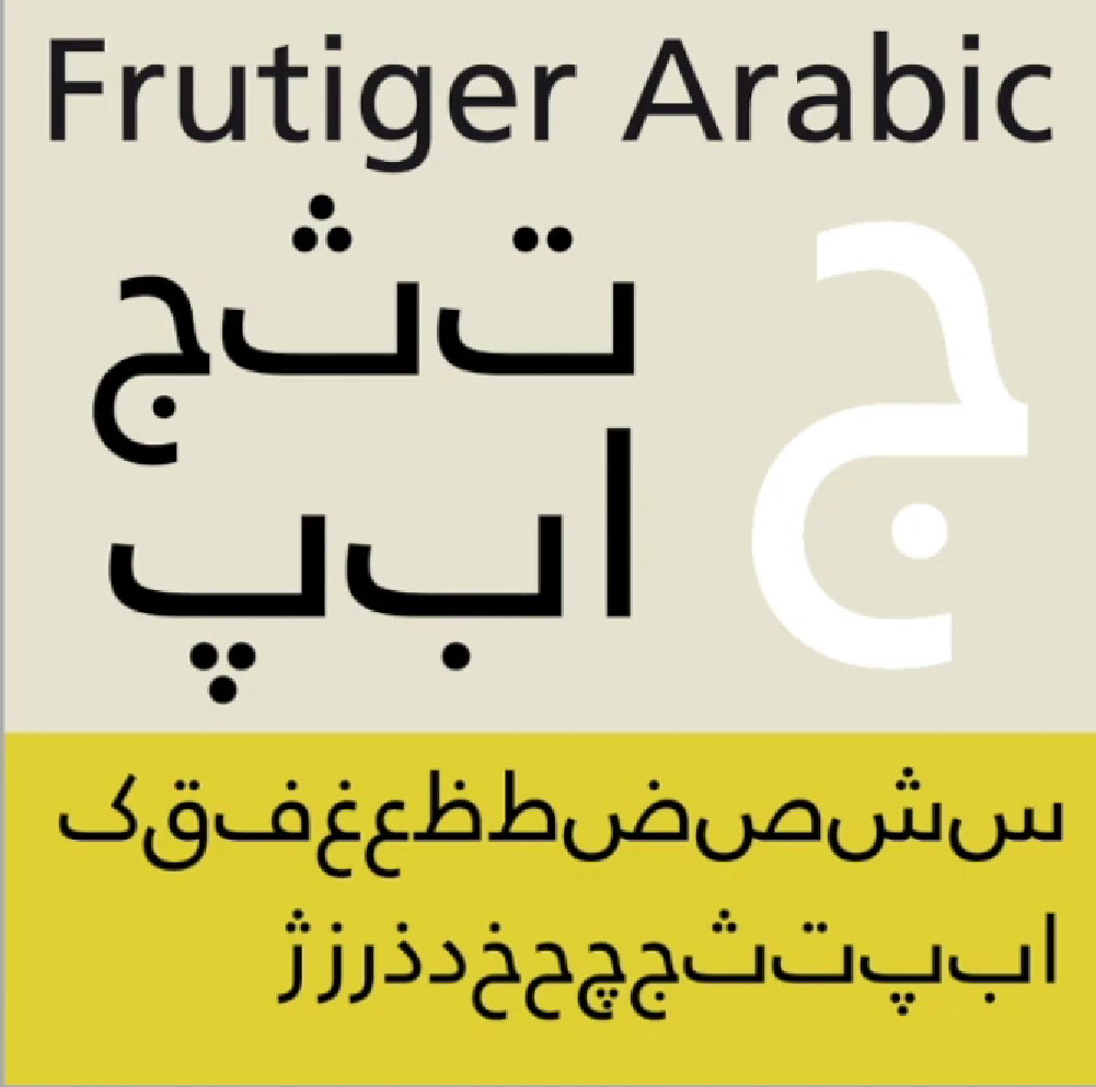
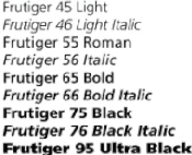
Fruitiger is a sans serif typeface designed by swiss type designer Adrian
Frutiger in 1968 for the international Airport in France.
Considerations and limitations
Letterforms needed to be recognised even in poor light condition

Adrian received many honors
Holy city of India
Designed a new Devanagari font for modern typesetting and printing
processes
His draft got approved

Verdana for Microsoft
The font was tuned to be extremely legible even at very small sizes on
screen due in part popularity on internet
Exhibit characteristics derived from the pixels rather than the pen, he
brush or the chisel
Commissioned the design of a new typeface
Solved multiple technical and visual problems

Asked to create a typeface with bold simplicity
Modern yet rooted in tradition
Combined classical roman proportions with humanist warmth
Different companies all using the same rails and tunnels
All the signages was completely different
Applied the proportions of roman letters to his typeface

Johnson sans is similar to gill sans
Student driven by guilt of seeing the success of his own typeface, gill
sans
General process of type Design
Research
Sketching
Digitalising
Testing
Deploy
Research
We would understand type history
Type autonomy and type convections
Know terminologies, side bearings and hunting
Determine the type purpose
Different applications
Examine existing fonts
inspirations / ideas/ reference/ context/ usage pattern/ etc.

Sketching
Designers sketch their typeface using the traditional tool set/ brushes/
pens/ ink and paper
Scan them for the purpose of digitalsiation
More confident their hands and have better control using it
Some sketch their design with wacom directly into a font design (much
quicker, persistent and consistent)
Both methods have positives and negatives

Digitalisation
Fontlab and glyphs app
Adobe illustrator to design or craft the letterforms
Attention should be given on the whole form and counter form
Readability of the typeface is heavily depended on it
Testing
Important component in the design thinking process
Process and refining and correcting aspects of the typeface category
Readability and legibility of the typeface becomes an important
consideration
Crucial if the typeface is a display type
Deploy
Teething problems
Task of revision doesnt end upon deployment
Rigour of the testing is important
Teething issue remains minor

Constructions and considerations
Forms and constructions are taken into account
Important visual correction
Extrusion of curved
Vertical alignment between curved and straight forms
Cannot be covered entirely in a single lecture
There are many approaches and considerations provided in the link
Instructions
Task 2
Task 2(A): Key Artwork
We are to make a Key Artwork sort of like a logo of our name. We are
allowed to used our full name/ initials to form this artwork. Explore as
many combination of artwork as possible. This task will then continue to be
used in task 2(B).
- Explore as many combination of artwork as possible
- Explore and understand what we like
- Make a mindmap of the things we like
- Make an artwork from type
- Elegant solution, visual communication
1. Ideation and sketches
I tried to start off with a mindmap first to understand and recall what I like before I start sketching.
The mindmap making process is more of a brainstorming ideas process for me as
during the process I get to recall all the things and hobbies I like, my
characteristics and traits. Which then lead me to sketch out my ideas on a
piece of paper, I prefer to sketch with traditional paper and pencil as there
is no limitation of combination of design and type.
Sketches

Fig. 1.1 Initial sketch

Fig. 1.2 Initial sketch 2
Top left option:
I was going for something like a magical fantasy type of combination and
design, realised that it kinda look like the title font from MyLittlePony
which is a cartoon series that I used to watch all the time, the long tails
look like the tails of a pony.
It's as easy as i LOVE butterflies and I find them beautiful yet hold a big symbolism with I strive to become. If you have heard of the saying that one flap from a butterfly's wings can cause a hurricane on the other side which is a huge impact it is capable to make. I want to be like that, as small as my effort may seem, I hope the result is impactful and leaves a good impression on people. Which is why I decided to include my name into the butterfly and was thinking of warping it later on.
Right top corner:
If you look closely, this design is actually my name that were made to look
like musical notes floating above each other. I love singing and is the Vice
President of L.I.V.E. Club, an acapella singing club. I have been ever since i
could remember and sang till this day, still have a growing passion for it so
I decided to have my name designed after to look like musical notes to remind
myself that music is that I love is my safe haven, and that i can always find
comfort there.


Serif, Sans Serif, and Script
2. Digitalisation
Design 1:

Fig. 1.3 1st wordmark process 1

Fig 1.4 1st wordmark process 2
For this initial design, I was just trying to recreate the one that I have
sketched out with pencil and paper from above by first choosing the right
typeface that represented my traits and then add tails to the top and
bottom of the letters.
Design 2:
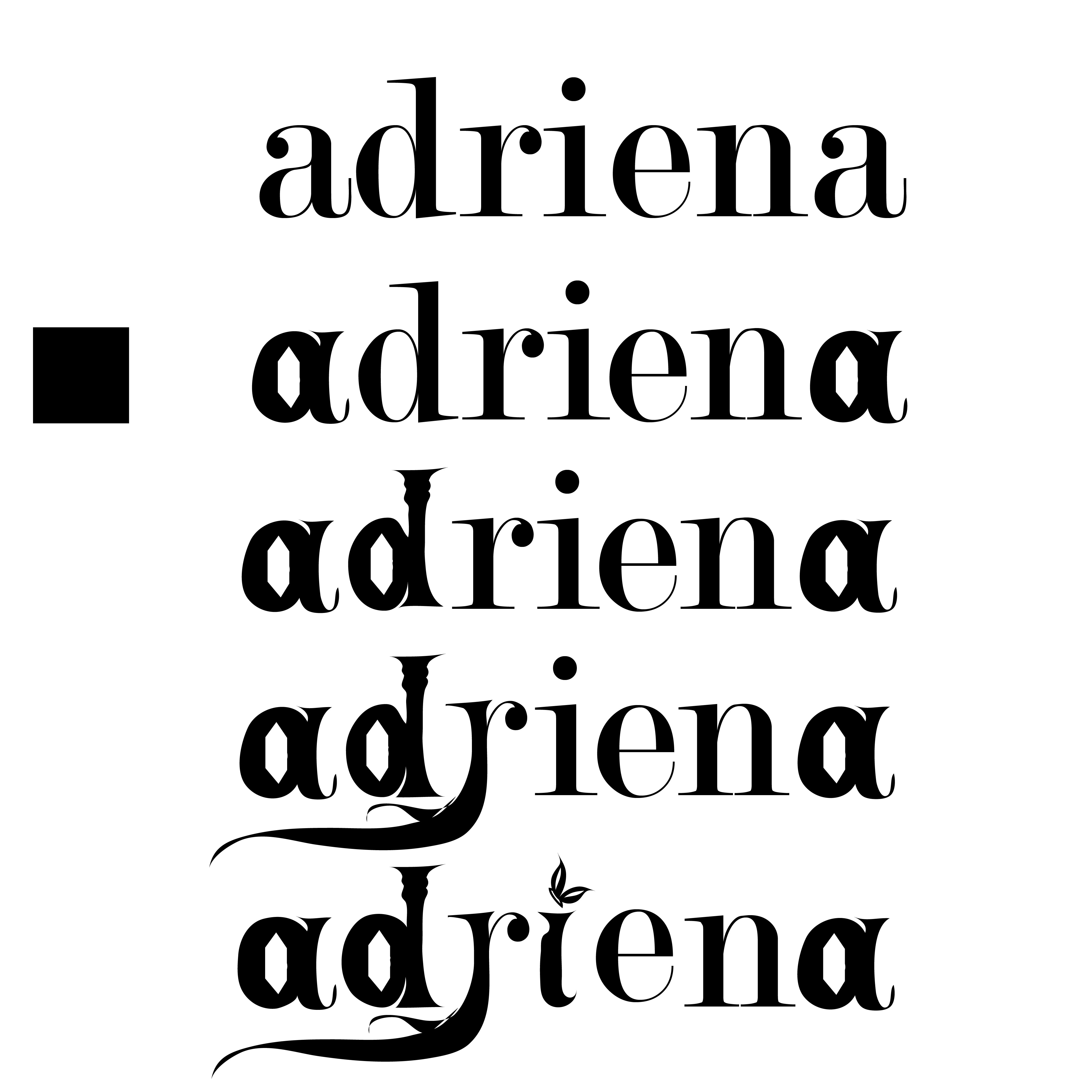
Fig. 1.5 2nd wordmark process 1

Fig 1.6 2nd wordmark process 2

Fig 1.7 Final second wordmark
For this I'm also figuring out how to digitalise the sketch that I did which
start from an existing type then step by step developing the necessary
elements to resemble the one in the sketch. I have also added stars on top
of the letter d to indicate that it is a magical staff and roots growing out
of some letters. In my opinion, the ending result resemble a game title with
the magical, adventurous type design.
Design 3:


Fig 1.8 Butterfly wordmark creation process
The butterfly font is actually the most challenging one to make out of all
of them because I initially wanted to use the warping tool in AI but it
didn't work as the font got distorted in the shape of the butterfly and it
was illegible. Therefore, I decided to draw on the type one by one to see
how it fits into the butterfly shape i have sketched out. I did go through a
few trials and errors to figure out the best butterfly shape that would best
fit both my characteristic as well as the typeface legibility. I soon find
that irregular shape type is my best bet so i went with it till I filled up
the whole shape with my name, 3 letters on the left wing and 3 letters on
the right wing. The letter I as the body of the butterfly.

Fig. 1.9 Butterfly wordmark on a t shirt template
Mr. Vinod asked us to do this which is to add to a t shirt collateral so see
how it looks and print it out in class to get consultation from him. Got
feedback from him to tweak the overall design a little bit to improve the
legibility especially the letters N and As.

Fig 1.10 Butterfly wordmark flaw
With the help of my friends' ideas and suggestions i managed to make the N
look like an actual letter N again.

Fig 1.11 Butterfly wordmark second flaw
Over here, Mr. Vinod had me to join the 2 parts of the A together and and
make their connecting line thinner which worked out somehow after a few more
trials in AI.
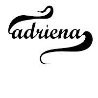
Final Key Artwork
 Fig. 1.12 Final key artwork for Task 2(A)
3. Wordmark Expansion
 Fig. 2.1 First batch of colour palette
The gradient is my initial colour palette but was rejected by
Mr.Vinod as he said that gradient and pastel colours does not work on
wordmark. Hence, I change the colour to full green and green and dark
blue but the vibe it's giving off is a little to eco friendly to
represent me.
 Fig 2.2 expanding my key artwork
Here i'm just expanding my wordmark design to see what kind of
combination of elements I can so and what kind of other colours
combination works best other than green and pink.
 Fig 2.3 First completed wordmark
The updated wordmark with smoothen out edges and updated
background. I made changes to the body, wings and body to a little
sharper and straighter lines than the original one.
 Fig 2.4 Further expansion
Just doing the final expansion on the wordmark alone to see how it
works together and also laying out
the colour palette as sir told to.
 Fig 2.5 Arranging the expansions
Displaying my key artwork expansion to see how it works
together, changing a few arrangements along the way till I'm
happy with the combination.
4. Wordmark Collateral
Process
 Fig 3.1 eyeshadow palette sample
Changing the eyeshadow palette colour to pink and black in
photo shop from this original peach colour to match my colour
palette.
 Fig 3.2 pink paper bag
 Fig 3.3 black paper bag
The first design for the paper bag before changing after sir
suggest so. Sir wanted me to add elements to the key artwork to
create a pattern then somehow add the original key artwork at
the bottom somewhere.
 Fig 3.4 expanded pattern
Arranging the element to make a pattern like sir suggested.
Redoing the paper bag collateral replacing it with a new
design in both pink and black.
 Fig 3.5 app icon
The app icon without make it into 3D. Initially wanted to
keep it like this but i experimented with the 3D feature on
illustrator and liked the result.
Final Collateral

Fig. 4.1 Final key artwork black and white jpg
 Fig. 4.2 Final key artwork (with colour) jpg
 Fig. 4.3 Final key artwork animation gif
 Fig. 4.4 Key artwork colour palette jpeg
 Fig. 4.5 Pink shopping bag (collateral 1).jpeg
 Fig. 4.6 Black shopping bag (collateral 2).jpeg
 Fig. 4.7 Eyeshadow palette pink (collateral
3).jpeg
Fig. 4.7 Eyeshadow palette pink (collateral
3).jpeg
 Fig. 4.8 Eyeshadow palette black (collateral 4).jpeg
 Fig. 4.9 App Icon (collateral 5).jpeg
 Fig. 4.10 phone instagram screenshot jpeg
 Fig. 4.11 desktop instagram screenshot
Fig. 4.12 Final collateral pdf
Feedback
Final Key Artwork

Fig. 2.1 First batch of colour palette
The gradient is my initial colour palette but was rejected by
Mr.Vinod as he said that gradient and pastel colours does not work on
wordmark. Hence, I change the colour to full green and green and dark
blue but the vibe it's giving off is a little to eco friendly to
represent me.
Fig 2.2 expanding my key artwork
Here i'm just expanding my wordmark design to see what kind of
combination of elements I can so and what kind of other colours
combination works best other than green and pink.
Fig 2.3 First completed wordmark
The updated wordmark with smoothen out edges and updated
background. I made changes to the body, wings and body to a little
sharper and straighter lines than the original one.
Fig 2.4 Further expansion
Just doing the final expansion on the wordmark alone to see how it
works together and also laying out
the colour palette as sir told to.
Fig 2.5 Arranging the expansions
Displaying my key artwork expansion to see how it works
together, changing a few arrangements along the way till I'm
happy with the combination.
4. Wordmark Collateral
Process

Fig 3.1 eyeshadow palette sample
Changing the eyeshadow palette colour to pink and black in
photo shop from this original peach colour to match my colour
palette.

Fig 3.2 pink paper bag

Fig 3.3 black paper bag
The first design for the paper bag before changing after sir
suggest so. Sir wanted me to add elements to the key artwork to
create a pattern then somehow add the original key artwork at
the bottom somewhere.
Fig 3.4 expanded pattern
Arranging the element to make a pattern like sir suggested.
Redoing the paper bag collateral replacing it with a new
design in both pink and black.
Fig 3.5 app icon
The app icon without make it into 3D. Initially wanted to
keep it like this but i experimented with the 3D feature on
illustrator and liked the result.
Final Collateral

Fig. 4.1 Final key artwork black and white jpg

Fig. 4.2 Final key artwork (with colour) jpg

Fig. 4.3 Final key artwork animation gif

Fig. 4.4 Key artwork colour palette jpeg

Fig. 4.5 Pink shopping bag (collateral 1).jpeg

Fig. 4.6 Black shopping bag (collateral 2).jpeg

Fig. 4.7 Eyeshadow palette pink (collateral
3).jpeg

Fig. 4.8 Eyeshadow palette black (collateral 4).jpeg

Fig. 4.9 App Icon (collateral 5).jpeg

Fig. 4.10 phone instagram screenshot jpeg

Fig. 4.11 desktop instagram screenshot
Fig. 4.12 Final collateral pdf
Week 4:
General Feedback: He gave us a talk on our specialisation. We
need to know what the wordmark we are designing means, it needs to
represent us and not just visually pleasing. Find common factor from the
type.
Personal Feedback: For my poster, I need to change the
information font because it is fighting for attention from my extraction
font. For the wordmark, the fantasy idea is good, but I need to work on
it really fast and figure out the typeface. The butterfly one need to be
more well executed.
Week 5:
General Feedback: Make sure your wordmark is balanced.
Specific Feedback: No specific feedback.
Week 6:
General Feedback: Collateral: Expand your brand identity, do
not copy and paste
T-shirt: The wordmark can spread throughout the T-shirt by using the
texture or pattern of the wordmark. Look into big brand's wordmarks
(Coca-Cola, Louis Vuitton, etc)
Study them and understand how they translate their brand
characteristics.
Specific Feedback: The thick and thin strokes, unstable mark
(Ensure it's in a horizontal position). The placement of the letter
has to have "readability" and balanced structure. The "O" can't be
seen, it is not visible at one glance.
Week 7:
General Feedback: Don’t repeatedly use the wordmark for every
post, create an identity by expressing more from the wordmark in a
creative way.
Specific Feedback: Try combining the “a” and “f” together to
create ligature and make sure their weight strokes are the same.
Continue to work on my idea and proposal for the final project.
Reflection
Experience
All I can say is that everything was smooth sailing in the beginning until
the part where i have to pick a colour palette. Task 2A for me was a more
enjoyable process compare to task 2b as it requires me to explore my
creativity and understands better about myself n order to have the wordmark
expressed as myself. As for task 2b, it was stressful for me as I couldnt
seem to figure out the right expansion and colour that i am happy with.
Observations
From this task, I had observed that understanding colour combinations is
important for a brand identity. I had learned that pastel colour doesnt
work well as a brand colour as it's not eye catching enough. I also need
to pay attention to the readability of a wordmark as it reader and viewers
might misunderstand if the readability is not clear.
Findings
I found out that doing collateral is not all about slapping your logo onto
products to just have it as yours. We have to take the time and make the
effort to properly expands the wordmark and design it that is fitting with
the product itself. I find that this task requires a lot of idea exploration
to develop a decent design for each of our products. Idea exploration
encourages creativity. It's the process of thinking beyond conventional
boundaries, fostering innovation and differentiation. By exploring multiple
ideas, you increase the chances of stumbling upon a unique and
groundbreaking design.
Further Reading
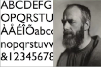
Serif typefaces have small projecting features at the end of strokes, added as
an embellishment to the basic form of the character. Serifs were needed when
type was chiseled into stone, before paper was invented. In practice, serif
typefaces feel timeless, elegant, trustworthy and retro.
Sans serif typefaces lack serifs, and therefore feel cleaner, simpler
and more modern on the page. Sans serif fonts are easier to read on a
computer, because the square nature of the pixel makes the subtle curves on
serif type hard to render.
Script typefaces are reminiscent of hand writing and lettering. They
try to bring the same authenticity that hand writing creates. They are often
used sparingly in combination with other typefaces
Typeface anatomy
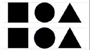
Understanding the anatomy of a typeface can help students conduct more productive critique and discussion about type. There are many intricate details when one looks closer at a type character itself. Looking at the handout, when comparing serif typefaces to sans serif typefaces, it's evident that serif typefaces in general have smaller x-heights and longer ascenders and descenders. The cap height is generally shorter than the length of the ascender. In addition, the letter "o" dips below the baseline just ever so slightly.
Understanding the anatomy of a typeface can help students conduct more productive critique and discussion about type. There are many intricate details when one looks closer at a type character itself. Looking at the handout, when comparing serif typefaces to sans serif typefaces, it's evident that serif typefaces in general have smaller x-heights and longer ascenders and descenders. The cap height is generally shorter than the length of the ascender. In addition, the letter "o" dips below the baseline just ever so slightly.
Alignment is the arrangement in a straight line, often next to a
margin. Left aligned type is most common and the easiest to read. Justified
alignment can seem formal. Centered alignment is often used for minimal
amounts of type such as wedding invitations or in an ad. Right aligned type
needs to be used sparingly. Because the Western world reads from left to
right, aligning type on the right makes it more difficult to read. However,
right aligned type can also symbolize edginess or forward thinking because of
the slight discomfort we feel while reading it.
Line length is also important to consider because reading too long of a
line of text will cause the reader to have to move his or her head, which is
uncomfortable for the reader and can cause lines to be skipped or
doubled.
.jpg)
.jpg)

Comments
Post a Comment