Information Design - Project 1: Instructable Infographics Poster
20/2/2024 - 27/2/2024 / Week 3 - Week 4
Adriena Tan Yan Zi / 0351236
Information
Design / Bachelor of Design (Hons) in Creative Media
Project 1:
Instructable Infographics Poster

Instructions
Project 1: Instructable Infographics Poster
Assignment instruction:
An infographic poster for ONE recipe selected from Pasta
Grannies. Study one video, break down, and chunk the preparation and
cooking process into an instructable poster. Try to capture each Grandma’s
personality and unique dish identity in your poster as part of the narrative
structure.These infographics present complex information quickly and clearly, with symbols charts, and diagrams. With an information graphic, computer scientists, mathematicians, and statisticians develop and communicate concepts using a single symbol to process information.
You will be required to evaluate what parts of the topic, concept, or idea are most important to tell/demonstrate and ask how you would represent each piece of information best. You will also decide how to graphically represent the most salient facts about your topic, concept, or idea for student learning. This includes the finishing outcome which could be a slick animation or even a rough stop motion.
Theoretical (Information Design Framework)
- Information type
- Device
- Principles (LATCH etc)
- Aesthetics i.e: isometric, simplified illustrations
Practical - photo editing/illustration software
- Graphs, charts, and diagrams
- Poster size: 1240 × 1750 pixels or 2048 × 2048 pixels
Collecting information
Fig. 1.1 Chosen video from Pasta Grannies
This is the video that I chosen from the pasta grannies channel to base
my infographic on. It's about how Paula that lives in Austria, in an old
wooden house and loves making her signature soup canederli.
Fig 1.2 Information collected in google docs
Whilst gathering all the recipe, steps and extra information, I did my
sketch a few layouts and attach it in the above google docs. After getting
a few feedback from sir, he suggested me to go with the third sketch as it
is a slightly different sketch.
Visual Reference


Fig 1.3 Visual References from Pinterest
Digitalisation Process


Fig 2.1 Illustrating the bowl and Spatula
Here I'm just searching a porcelain bowl with blue flower patterns that I
found it resemble the mixing bowl that Paula's was using in the video. First
I was just tracing the shape of the bowl. Then, I used the pencil tool to
added further details like the flowers and leaves to get the accuracy. With
the bowl done, i moved on with drawing the spatula with the pencil and brush
too with a reference photo i found online.


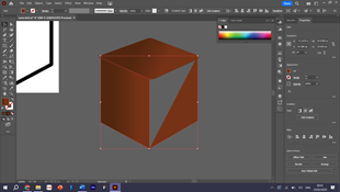
Fig 2.2 Illustrating the bread and breadcrumbs
The first element that I drew with reference I found on Pinterest was a
bread. I used the the pencil and pen tool for the basic shape of the bread.
Further on, I added more texture, shading and strokes with the brush tool.
Then, I figured that it would need the bread crumbs so it did it with the
pen tool and fill it in with the gradient tool.

Fig 2.3 Illustrating the salt shaker
This is the process of me making a salt, then I coloured in once again with
the gradient tool.

Fig 2.4 Aligning the elements
After I made few of my items, I proceed to line them up slanted like the
layout of my sketch. At first, I feel it looks fine and that I just have to
make sure to items size is consistent


Fig 2.5 Illustrating the eggs
Next up, I'm simply just tracing an oval shape and once again filled it in
with gradient tool. To indication one of the process, I also need to cut the
egg shape in 2 using the knife so I could draw the egg white and the egg
yolk.


Fig 2.6 Illustrating the pan
Moving on, I'm just drawing the all purpose flour and the pan that I needed
for the second step. I have a reference photo for most of the ingredients
that I needed to draw cause I couldn't remember what they look like on top
of my head.


Fig 2.7 Illustrating ingredients
Then, I moved on illustrating more ingredients for the broth and the
sauteing process, just onions, butter, specks or quote on quote meat. With
the same process of pencil, brush and pen tool, I manage to get a satisfying
art style. I also used different bush to create different texture.


Fig 2.8 Illustrating the pot an realigning
I was just illustrating the pot that was used in the video. Imitating
roughly using a screenshot from the video. It turned out quite well since I
have the oval lid top shape to refer to so I can create the pot angle facing
like that.


Fig 2.7 Illustrating the bowl and canederli
Finally, I moved on to making the main bowl and broth. While making bowl, I
also try to imitate the bowl used in the video which is a plain white bowl
but after making it I found it is not too appealing so I added texture and a
golden colour to the rim to make sure it fits the overall aesthetic
more.


Fig 2.7 Putting in background and aligning items again
After finishing all the elements, I started to arrange them accordingly
where I think would be easily digested my the viewers. I did trial and error
a lot of times before finally settling on a satisfactory arrangement to
place my elements and test. I added the detailed text one by one and also
use the perspective and free transform tool to change the perspective of the
text.
Moving on to make the background, initially I wanted to use blue background
to indicate that the food suitable for winter. But I found out that the
elements I created doesn't match the blue background so I took the
inspiration from the wooden house location in the video, made the
background wooden textured.
Furthermore, I moved on to work on the main title. Like I mentioned
previously, sir suggested I can approach the frosty font idea for the main
title because it's winter food to share with friends and family. So, I found
a suitable font after I went through different option in
dafont.com . I
did some customization to the main font so it would express the purpose of
the title more by adding snow pile and snow flakes.
As you can see, I decided to illustrated a ragdoll to incorporate one of
granny Paula's personality into the poster. I found some visual references
on pinterest, then tried to illustrate my own version with the reference. It
added an element of crepiness with is the vibe i get looking that her
collection of dolls.
Final Instructable Infographic Poster


Fig 3.1 Final Poster,jpg
Fig 3.2 Final Poster,pdf
Revised Instructable Infographic Poster

Fig 3.3 Revised poster.jpg
Feedback
Week 4General Feedback: Watch the example animation video that sir has posted in google classroom. Make sure to include data into the video. it's an infographic based animation so it doesn't have to be too complicated.
Specific Feedback: Change the steps label to the top of each section so that it looks consistent. Could get about 15/16 marks before being revised. Take away the X in the poster as it is a little confusing, can change the adjective to a bunch of parsley and a pinch of salt instead just 1 salt and 1 parsley.
Reflection
Initially, this assignment brought me joy as I delved into exploring design options and selecting a recipe that piqued my interest. However, as I progressed, the task became increasingly stressful. Aligning elements and text within the layout proved challenging, particularly when attempting to match their angles with the slanted background. I found myself rearranging elements numerous times, at least 6 or 7, in search of a pleasing alignment that didn't appear distorted.
Despite the difficulties, I persisted in finding a satisfactory alignment for all elements, only to encounter another obstacle. The background I had initially envisioned didn't complement the elements well, appearing out of place. Consequently, I made the decision to switch to a different background.
Upon completion, I sought feedback from my family, including my mother and both sisters, in hopes of identifying areas for improvement. My mother candidly remarked that everything looked cluttered, while one sister suggested adding shadows to create depth and reduce the flat appearance. The other advised against including instructional lines for each element. Unfortunately, I received their feedback too late to implement changes. Therefore, I'm eager to receive feedback from you, sir, before finalizing any decisions on what adjustments to make.
.jpg)
.jpg)

Comments
Post a Comment