Information Design - Exercises, FLIP Topics & Practical
6/2/2024 - 5/3/2024 / Week 1 - Week 5
Adriena Tan Yan Zi
(0351236)
Information Design / Bachelor of Design (Hons) in Creative
Media
Exercises, Flip Topics & Practical

Instructions
Exercise 1 - Quantify and Visualise Data
Drafts and testing formations
.jpeg)
.jpeg)
.jpeg)

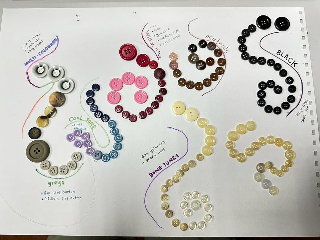
Fig 1.1 Formation drafts
During class, the lecturer was explaining on how we could category and
arrange our formation. He was explaining to us trying make sure our layout
has to make sense in the end. I was just trying different formations first
to see which one speaks to my liking the most before adding the labels. The
first one i was going for something IT or digital waves. The second one is
just spiral, and then diamonds/gems for the second and third. Lastly, just a
neat formation for a clean look.
Final Formation
Final 1.2 Final Exercise 1

Final 1.3 Final revised version
Exercise 2 - L.A.T.C.H
Research
During our recent in-person class on Thursday, our instructor elaborated on
the concept of L.A.T.C.H., outlining the essential elements required for an
effective L.A.T.C.H. infographic. Following this explanation, I conducted a
brief exploration to determine a suitable topic beyond the provided options of
Pokemon and dinosaurs. Eventually, I decided to base my infographic on the
popular cartoon show Adventure Time. Subsequently, I extensively researched
and gathered data and inspiration for this chosen topic, consolidating all
resources within an editable Google document.
Process
Illustrating background


Fig. 2.1 illustrating background and tree
Initially, after selecting the first sketch, I began outlining the shape of
the tree to serve as the main container for all my content. This approach
ensures that the information is organized within a designated space rather
than scattered everywhere. The central location of the tree draws the
audience's attention, prompting them to start reading the infographic from
there.
Moving on to cropping and illustrating the locations within the tree connecting each kingdom with each other and blending the tree trunk to the building in the lowest kingdom which is the underworld "Nightosphere".
Moving on to cropping and illustrating the locations within the tree connecting each kingdom with each other and blending the tree trunk to the building in the lowest kingdom which is the underworld "Nightosphere".
Illustrating characters and elements
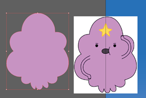


Fig 2.2 illustrating characters
In my illustration process, I'm depicting the elements and characters
necessary to convey the required information. Utilizing the pen and pencil
tools and drawing inspiration from online examples, I've achieved a
satisfactory result that aligns with the overall aesthetic of the infographic.
While this method may be more time-consuming compared to tracing or using
pre-existing PNG images of characters, I believe it's the most effective way
to ensure the elements are of the highest quality in terms of pixel
resolution. This attention to detail ensures that the visual components
maintain clarity and integrity within the infographic design.
As I neared completion, I included an illustrated signboard containing
elements symbolizing the information conveyed, aiming for a clear and concise
viewing experience. Placing it prominently in the top left corner ensures easy
visibility. Additionally, I applied a wood-like texture to the signboard to
seamlessly integrate it into the nature-inspired cartoon aesthetic of the
infographic.
Final infographic artwork

Fig 2.3 final infographic jpeg
Fig 2.4
final infographic pdf

Fig 2.5 Revised poster
FLIP Topics
Flip 1 (Group work) - Types of Infographic
Flip 1 (Group 4) - Types of infographic by Adriena TanFlip 1 (Individual work) - Re-designing infographic
During lecture on Week 1, the lecturer informed us that we will be working
on a FLIP task each week both group and individual and that we have to take
turn to present the next week. This week for our individual FLIP task, we
were suppose to re-design a poorly design infographic using a free online
tool.

Fig. 3.1 Poorly Chosen poorly designed infographic
Issues:
1. Over-crowded information
2. Too many shades of colour incorporated
3. Information not specific (for example from most data collected to
least)
4. Unappealing layout
5. Repeating information without summarising
6. Too plain of a layout to capture attention
7. Too little indication graphic used
Sketches

Fig 3.2 Sketches


Fig.3.3 Redesigning in Canva process
I managed to summarise most of the information, and range them one by one
from the most data collected app to the least before putting the
information in. I also went on a journey to figure what ofont and colour
would work well together yet still letting the information pop for easy
understanding.
.jpg)
Final Design
.jpg)
Fig 3.4 Final Improved Design
Flip 2 (Group work) - Saul Wurman's LATCH
Flip 2 - LATCH by Adriena TanFlip 3 (Group work) - Miller's Law Chunking
Flip Topic 3 by Adriena Tan
Flip 4 (Group work) - Manuel Lima’s 9 Directives Manifesto
Flip 4 - Manuel Lima’s 9 Directives Manifesto by Adriena Tan
Feedback
Week 1
General feedback:
Your layout design needs to have a meaning to it.
Specific feedback:
After the first layout, sir asked me to explore further before
settling.
Specific feedback: After the first layout, sir asked me to explore further before settling.
Week 2
General feedback:
We need to choose at least 4 out of the 5 categories to include in
our posters. Pokemon theme is overrated and that we are encouraged to
choose another theme. We should not only focus on the aesthetic part
of the infographic, but also focus on the information parts as
well.
Specific feedback:
Both layout is good but i should just choose the first as it is
easier to understand. Planning out my research in a google doc is a
good idea.
Week 3
General feedback:
Sir asked us to capture the personality of the pasta grannies, from
the colour, style, or hobbies these grannies could have and include it
in our poster.
Specific feedback: Go with the slanted layout cause he doesn't often see this kind
of layout. I can also go with a frosty font for my title to
indicate that the the chosen recipe is best consumed during
winter.
For exercise 2:
- Add character names
- make the location names bigger
- make the year font bigger to utilize the space
Specific feedback: Both layout is good but i should just choose the first as it is easier to understand. Planning out my research in a google doc is a good idea.
General feedback: Sir asked us to capture the personality of the pasta grannies, from the colour, style, or hobbies these grannies could have and include it in our poster.
For exercise 2:
Reflection
Engaging in these exercises has enhanced my ability to organize and
categorize information effectively, enabling me to incorporate all
essential details in a concise and clear manner. The exercises have
particularly encouraged me to experiment with various layouts, allowing me
to explore different arrangements for a single infographic. Many of my
layout ideas were sparked by browsing Pinterest for inspiration.
Moreover, this process has taught me the importance of prioritizing
information and arranging it efficiently. Rather than attempting to cram
every piece of data into a single infographic, I now understand the value
of selecting only the most relevant and necessary information. This
approach prevents overcrowding and excessive use of color, making the
infographic easier for viewers to digest and comprehend. Overall, these
exercises have not only improved my layout skills but also instilled in me
a deeper appreciation for the importance of clarity and efficiency in
visual communication.
Comments
Post a Comment