28/5/2023 - /6/2023 / Week 8 - Week
Adriena Tan Yan Zi /
0351236
Typography / Bachelor of Design in Creative Media / Taylors
University
Task 3 / Type Design and Communication
Lectures
All lectures has been completed. Please refer to
here.
Instructions
Type Design and Communication
1. Writing calligraphy / Letters
For this task we were asked to practice calligraphy on paper with
different mediums. Before we start doing our work digitally. the
lecturer wanted us to understand and experience the fundamentals of
calligraphy and how fonts were formed by exploring with the
mediums of our choice. Initially i went with the mediums, ballpoint pen,
marker, highlighter, gel pen and paintbrush. However, I decided to
change it soon because there was enough variation for me to work with.
So I redid the first task with highlighter, artline permanent, gel pen,
caligraphy brush pen, paintbrush. After that we, were asked to change the angle of each nib and
practice writing the letterforms.
Figure 1.1 Practice and final outcome of 5 pen nibs

Figure 1.2 Practice with different angles 5 different nibs
Figure 1.3 Practicing letterforms with the chosen tool
2. Visual references
.png)
Figure 2.1 References from Pinterest
3. Deconstruction
Figure 3.1 First deconstruction: Adobe Caslon Pro Bold
In the first deconstruction which I did it on the typeface, Adobe
Caslon Pro Bold were the letters n, p, t.
n:
-
The left stem has a different width with the right stem hence the
different colour on the 2 stems.
-
The left stem with serifs width are also different from the right
stem.
- The arcs are the same.
p:
- The width on stem is the same as the n stem.
-
The stem with the serif, however is different width compare to
the n one so the letters are not constant.
-
The overall width of the entire letter p is not same as the
letter n.
- The arcs and curves are constant.
t:
-
The letter t's stem width is unlike the one from the with of p
and n.
-
The overall width is also unlike the rest of the letters.
- curves and arcs are different from p and n.
Figure 3.2 Second deconstruction: Rockwell Extra Bold Regular
n:
- all the thickness of the stem in n is the same.
- thickness of the stems with serifs are identical.
- arc is constant
p:
- the thickness of the stem is the same as n.
- thickness with serif is the same.
- serifs lengths are the same.
- arcs and curves are larger compare to n.
- overall thickness has a slight difference.
t:
- stem thickness constant.
- arc and curves are the same and the letter n.
- serif is slightly longer than n and p.
4. Digitalising the written letters
Mr. Vinod introduces us to a few tools and we can resort to while
creating our digitalised letters. Those tools are the pen tool, brush
tool and some basic shapes and knife tool to add design to our letters.
With the practised demo version of our letters, we were asked to place
it in adobe illustator as a reference, no design just basics shapes and
strokes to reuse them for other letters.

Figure 4.1 Basic strokes
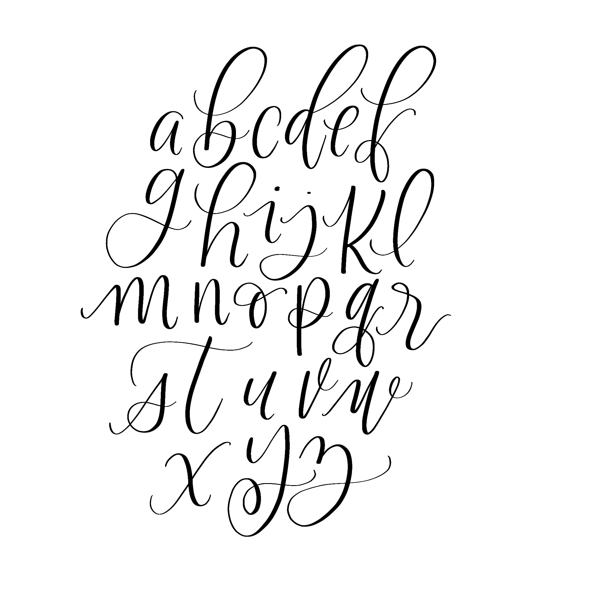
Figure 4.2 First attempt on digitalising
I find it slightly hard are to stick to only one tool so I jumped back
and forth with the tools that I am more comfortable with which is the
brush and the pencil tool. My first attempt got feedback from Mr. Vinod
saying that some of the strokes are too wobbly and that I can try using
the pen tool like he demonstrated but I couldn't catch on to every
single details that when he uses the shortcut keys on my keypad.
However, I don't want to keep him only helping me for too long as he
needs to assists the rest of the class to I just remain quiet.
Figure 4.3 First refinement
For the first attempt, I tried to stick more to only using the brush and
the pen tool. Mostly the brush tools for a few strokes then reuse the
strokes for other letters to stay consistent. I did meddle around with
the tools going back and forth with them until I found a consistent
style and stroke that I am happy, I also took inspiration from the
example Mr. Vinod shown in my ai work. Personally, i quite like how the
letter g and y looked the most then tried to recreated the same vibe
with the rest of the alphabets.
Figure 4.4 Second refinement
Second attempt, i tried to round some of the edges to see how it would
look like and whether I would like it. I find that the change i made to
the type made it look cute so i decided to keep the changes. However, it
doesn't look consistent enough so I made further changes to it.
5. Putting the fonts into Fontlab
5.1 Making symbols
After, I finish making the fonts, I found out that we're supposed to do
the exclamation mark, the comma, period and hashtag. I tried to stick
with the bubbly roundness of my type while making the symbols.
Initially, I wanted to make my hashtag lines straight and not slanted
but we got feedback from sir saying that we have to make the lines
slanted so I readjust the angle which leads to this final result.
5.2 Inserting the fonts into Fontlab
After all the refinement and making of the symbols, I smack the words
into Fontlab. Initially, I faced an issue where I can't paste the
letters into fontlab from illustrator. Therefore, it took me a little
longer than usual to do the work, clueless whether this issue is cause
by illustrator or is it just a Fontlab bug. In Fontlab we were asked
to determine the x-height, ascender, descender, baseline to make sure
that the font size is constant when we type into the new metrix
window.
5.3 Before and after kerning
After putting each of the letters in which I also added a few more
font like o, c and l. Then, I notice that there are kerning in the new
matrix window to be done here and there. I went ahead and did the
kerning until I'm satisfied that the spaces are even and pleasing to
the eyes.
6. Poster
Moving on from the Fontlab process, we were asked to create a poster
with all the given words in A4 size, no graphical elements, in
grayscale.
6.1 The first attempt
In this first attempt, I didn't know that we are not allowed to use
graphical elements. However, i was thinking that the circles would
portray bubbles to suit the font bur was then dismissed because of
the elements used. I took me a few tries to get my bubble word into
Adobe Illustrator because the Fontlab didn't save my font under the
font name that I wanted so there was that struggle.
6.2 Second attempt
Going into the second phase which i tried to make the poster simple
with the graphical element. But, the more i look at the, it doesn't
seem to be giving impact. In the end, I needed to reword on my
poster as I just found out that we have to include all the letters
given in the Module information.
6.3 Third attempt
Finally I came to the end and found a phrase that has all the letter
we needed to include and did this. I took some inspiration from a
friend's work that was sitting next to me and asked for several
opinions until I came to a result with different colours in the
grayscale. After getting a feedback from Mr. Vinod, he suggested me to
change the background into black 95% and try not to have too much
colour different. I was pretty happy with the layout and the colour
scheme and so I stick with this as the end result.
7. Final work
Figure 7.1 New Metric Window with Sentence Screengrab
Figure 7.2 Final Construction of Bubble (Regular)(JPEG)
Figure 7.3 Final poster "Karma pay a great price, yet I gain
Figure 7.4 Final Construction of "Bubble"(Regular)(PDF)
Figure 7.5 Figure 7.3 Final poster "Karma pay a great price, yet I gain
(PDF)
8. Font Tester
Test my font:
Feedback
Week 9:
General Feedback: We should try to update and fix our past mistakes from the past tasks or the existing marks will be deducted. Selecting and digitising our work in class.
Specific Feedback: Try to stick to pen tool and shapes to keep the design constant for each letter. Some letters exceeded the guidlines so try to keep it within the guidelines.
Week 10:
General feedback: Sometimes starting over again is faster than trying to adjust and fix our old work. Specific Feedback: Sir asked me to make everything straight and smooth, start making small refinement from there once everything is smooth. Make minor but noticable refinement, proceed with the pencil tool and have backup shapes for each letter.
Week 12:
General feedback: Construct and make changes to our to type poster. Put into preview so that other classmates can walk around and refer.
Specific feedback: Try not to have too many colours in my poster, can trun my background into 95% black. Font colours change it to white, no graphical elements and we must include all the words given.
Reflection
Experience: Through the experience I gained from this task, I learned the most from this task and found this task to be the most fun. We get to express our creativity and I get to have a taste of making a design font that I like. For the longest time, i always wanted to created a font that resemble bubbles or balloons and in this task I finally got to do that which was fun. After creating my own font, it made me so happy to get to play with it and even use it in the poster.
Observations: My observations are that through the font deconstruction process, not all official font or the most well known font is not always perfect. It has flaws and that what makes it a design. While making my own font, I find the process very detailed oriented so even minor refinements cause impact to the to the vibe of the entire font style.
Findings: Out of all the task, I find this task requires the most patience which i have none and honestly in the progress, I have so many breakdown because Mr. Vinod does not seem to like my font style and I am not too fond of the changes he suggested me to make. From sketching to digitalising to putting them into Fontlab, each steps are to followed strictly and not to be skipped as it is important that would affect our final outcome.
Further Reading
Typography
Figure 8.1 Typography book
Serif: A serif is the pointed ending of a stroke as in “I” or “T”. This is inspired by the letters carved on stone, using chisels. Thickness of the strokes also changes in these letter forms, like those drawn by flat brushes.
Sans Serif: Sans serif fonts give a modern look and
is widely used in logos and symbols, packaging, signages,
websites, mobile phone interfaces, gaming consoles etc.
Script: The letters imitate the feeling of calligraphic nibs, with a
slant to the right and changing thickness of strokes. These
fonts give a festive and personal look to the reader and are
very commonly used in wedding invitations.
Anatomy of a Font
As human body has many parts for identification like head,
neck, shoulder, arms, tail, foot etc., Type Forms or Font face
are also divided into parts, which we study under ‘anatomy
of fonts’. Some examples you will see below:
• Shirorekha connotes headline
• Skandharekha, is equivalent to shoulderline
• Padarekha means baseline
Counter Space
The empty space or negative space inside a letter form is
called a counter. Shape of the counter varies according to
the designer who creates the font.
Weight
The amount of boldness in a stroke is called weight. Many fonts
are available in different “weights”, like Thin or Light, Regular,
Bold, Extra Bold (or Extra Black) etc.
By changing the weight of the font, one can empasise or
express the meaning of the word.
Bubble
An unwanted ugly white space which appears between words
is called a Bubble.
River
A series of white spaces or Bubbles make an ugly white line
in a paragraph, called a river. This too causes discomfort in
reading.
Expressive Typography A designer can use fonts creatively for expressing various
emotions. One can select a font which can convey an emotion
or you can play around with the way you use letters.
.jpg)


.png)


.jpg)
.jpg)

Comments
Post a Comment